

Sarah Pauli
Case study
A brand love affair
Some brands begin with a business plan. Others begin with a feeling.
services
Brand Foundation
Visual Identity
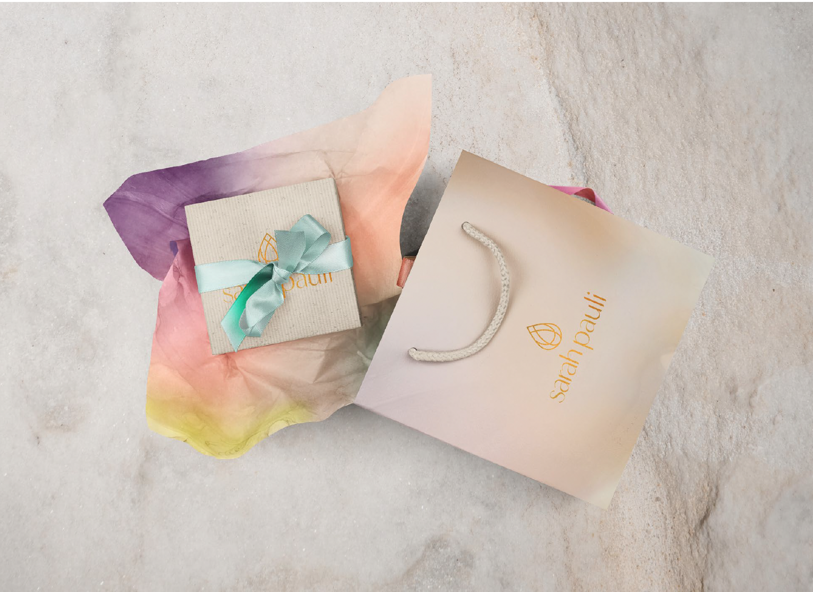
Packaging & Physical Touchpoints
Unboxing Experience
Ecommerce Experience
Print & Brand Collateral
Sarah Pauli’s jewelry belongs firmly in the latter. Each piece is intentionally handcrafted in Sedona, shaped by color, movement, and the quiet energy of the landscape itself. Her work is poetic and feminine, designed to move with the body — light, expressive, and imbued with meaning. The jewelry is not meant to overpower, but to amplify the inner glow of the women who wear it.
When Sarah came to Indigo, she was returning to her craft after time away — ready to bring her jewelry back into the world with clarity, intention, and reverence for the work itself. While she initially came seeking a logo, it quickly became clear that what was needed was a foundation: a brand system that could honor the depth of her artistry while giving it structure, longevity, and room to grow.
We began where Indigo always begins — with foundational branding. Together, we defined the heart of the brand: its purpose, values, and emotional positioning. Sarah brought a strong creative vision and an intuitive sense of style, shaped by years of experience as an artist and designer. Our role was to translate that instinct into a cohesive identity system — one that felt grounded, elevated, and deeply aligned with the jewelry itself.
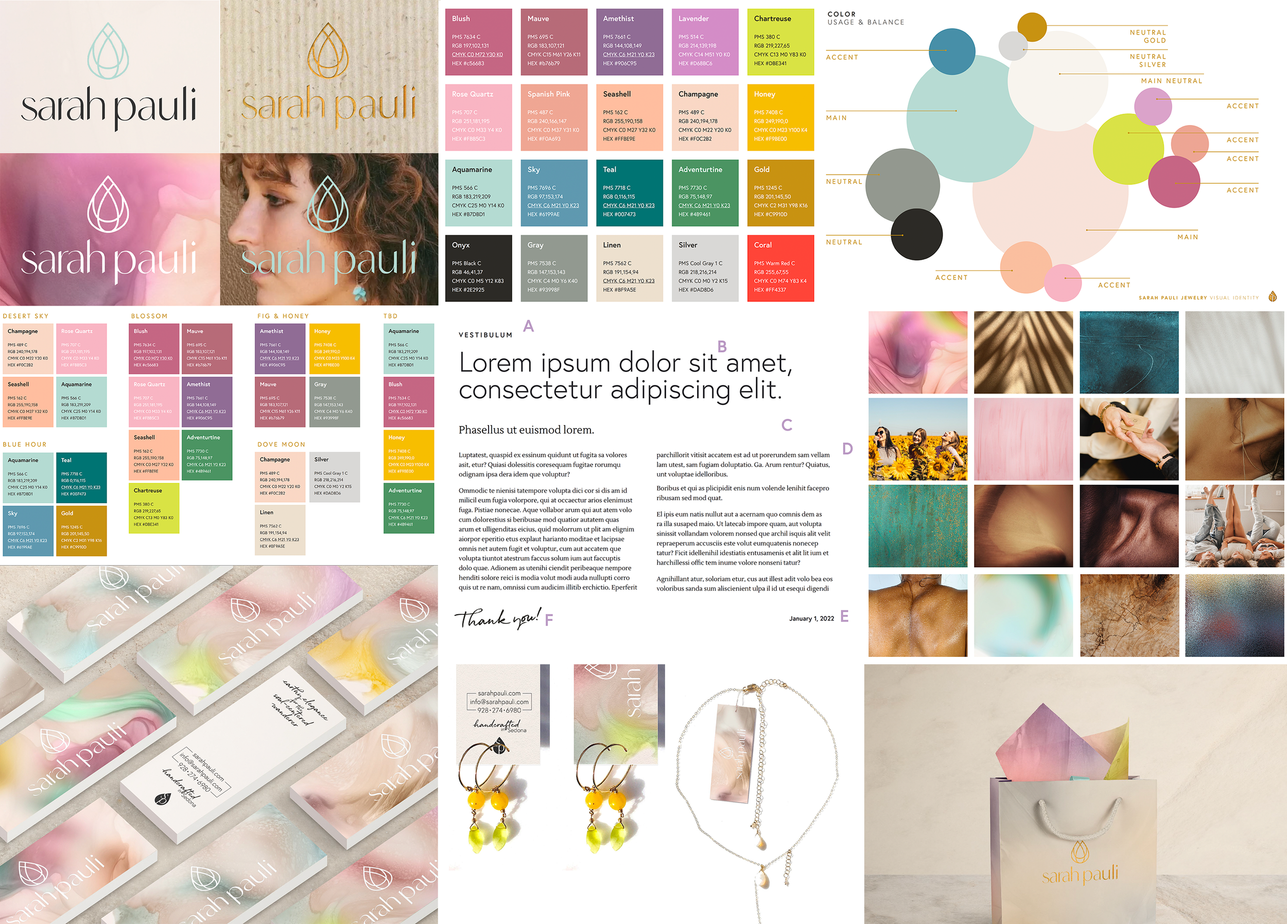
A Visual Identity Rooted in Feeling
The visual identity was designed to feel as intentional as the pieces Sarah creates. Soft gradients and mineral-inspired tones echo gemstones, desert skies, and watery light. The color palette balances warmth and airiness — blush, aquamarine, champagne, onyx, gold — evoking harmony, sensuality, and ease.
Typography plays a quiet but critical role. Clean, modern letterforms create clarity and restraint, while softer serif elements and handwritten accents introduce intimacy and humanity. The result is a system that feels both refined and personal — never loud, never trend-driven.
At the center of the identity is the mark itself: a jewel-like symbol that feels organic and symbolic rather than ornamental. It functions as both a signature and a seal — flexible enough to live across digital, print, packaging, and even engraved details, while remaining unmistakably Sarah Pauli.
Bringing the Brand to Life
From there, the brand extended naturally into tangible expressions. Packaging, hang tags, labels, and printed materials were designed as an extension of the jewelry experience — understated, tactile, and thoughtful. Nothing is excessive. Every detail exists to support the work, not compete with it.
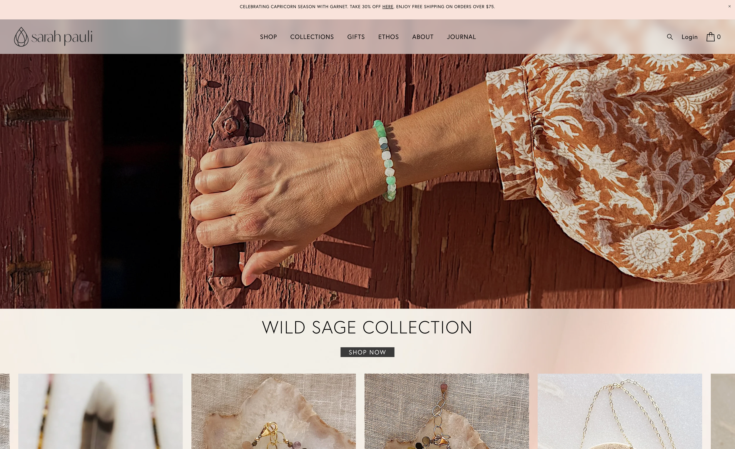
The ecommerce website followed the same philosophy. Built using Indigo’s ecommerce strategy framework, the site was designed to feel calm and immersive — allowing the jewelry to be discovered slowly, without urgency or noise. Product storytelling, photography, and navigation were all carefully considered to reflect the way Sarah wants her work to be experienced: with presence, appreciation, and trust.
While the brand feels intimate and handcrafted, it is grounded in real industry credibility. Prior to pausing her business, Sarah’s collections were carried by respected retailers including Sundance Catalogue, Anthropologie, and Barneys — a testament to both the quality of her work and her longstanding place within the design world. That legacy informed the care taken in building the brand anew — not as a reinvention, but as a continuation.
A Shared Vision
Working with Sarah was a true partnership — one rooted in mutual respect, shared values, and a deep love for the work itself. She is an artist in the truest sense, and it was a privilege to help shape the structure around her vision so it could thrive again.
The result is a brand that feels soulful, confident, and enduring. One that honors the handmade. One that invites connection. One that feels as beautiful to experience as the jewelry itself.
Indigo is deeply honored to be part of the Sarah Pauli story — and proud to have helped bring this brand to life with the care it deserves.